You’re a reader, right?
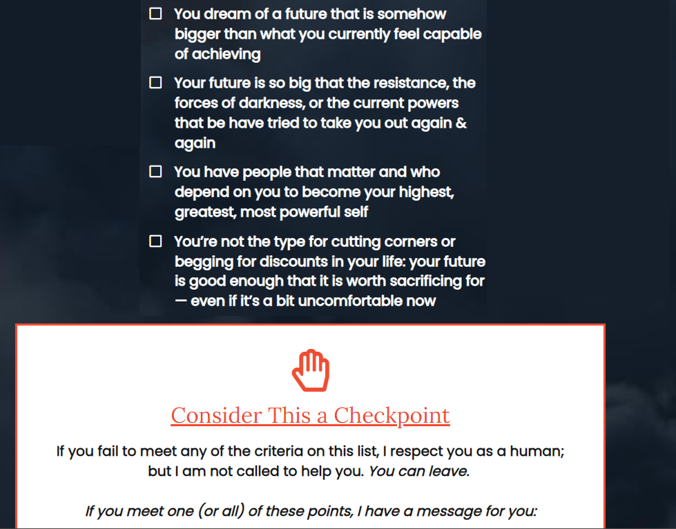
I know you’ve seen copy like this before:
I want to point out a few things about this copy device, which I call an identity preframe.
You see them at the beginning of sales pages/VSLs, webinars and occasionally on a website homepage.
Maybe you’ve even used something like this before.
Here’s the thing…
The identity preframe is set up to look like a filter.
A few seconds or centimeters of copy to make sure you’re only talking to ideal clients (and everyone else knows not to waste their time).
The example above even had a STOP hand and explicitly tells the reader to leave if he doesn’t meet the criteria.
It’s not a filter.
When done right it:
- makes you identify a characteristic you possess (or think you possess) but wish was more pronounced
- gives you a sense of empowerment
- heightens the desire for the transformation.
Despite its construction, the copy isn’t designed to make anyone stop and leave. Rather, the idea is to make most readers stay and read more. To think “this presentation/pitch is all about the me I want to be.“
The example above goes a step further.
Bullet point #3 adds guilt into the mix. You’re going to fail your loved ones if you don’t step fully into this identity.
This kind of copy frames the rest of the copy in the perspective of “the me I want to be.”
Appeals to (aspirational) identity hit at a deeper level than features, benefits, advantages and opportunities can by themselves.
And certainly deeper than saying “this is for service providers, parents and 9-to-fivers who are thinking about starting their own business.”
How are you getting viewers/readers to see “the me I want to be” in your copy?


